


Hello Mike,
So … what we have here is the basic DESIGN + MOTIF ideas that I propose to incorporate into your site.
For the sake of time and simplicity, I am not going to get into the SEO side of things; but, SEO is a necessary component of your website and I think we should invest the work in checking the basic SEO boxes that Squarespace gives.
What we have ABOVE would be a visual introduction of what I’m calling the CORNER CARD and what would be a PORTRAIT of you.
The CORNER CARD will be used throughout the site to display different information like the title, status (in development, in progress, completed), and other details of a project.
The PORTRAIT is necessary because people want to know who the person is behind these beautiful structures. NONE of the contractor sites that I have researched - city-wide, nation-wide - lead with their mug. I see this as a huge opportunity to both differentiate yourself and to give people what they want, which is that human + personal element.
What we have BELOW is just some different ways that I can incorporate the CORNER CARD with IMAGES into the design of the site. I hope this is enough to spark the imagination … if not your imagination in regard to web design, then maybe your imagination in regard to what my imagination will conjure.
CORNER CARD + IMAGE EXAMPLES


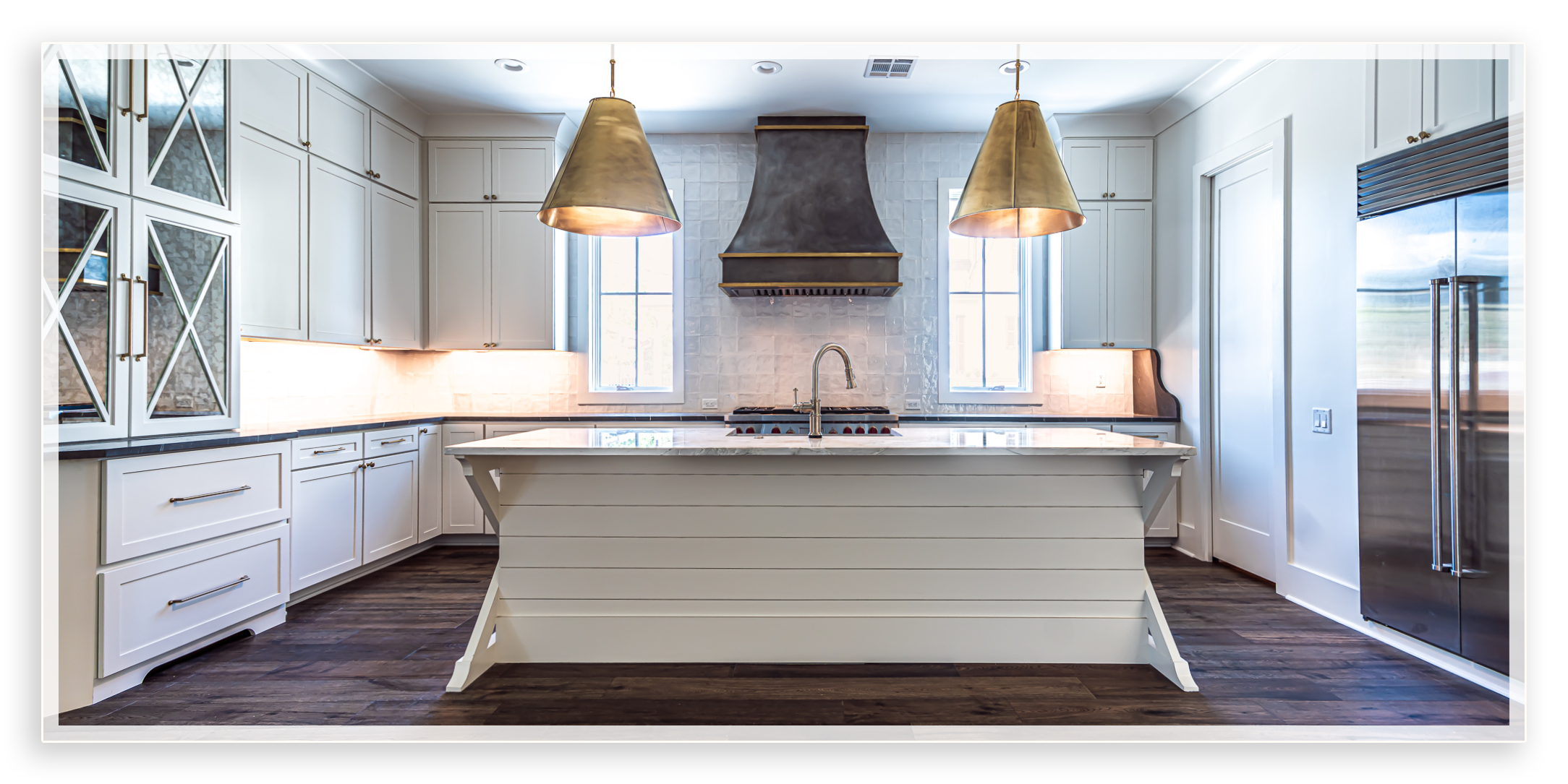
THE MONEY SHOT
I’m calling the image below the MONEY SHOT. We need at least one MONEY SHOT for each project you do. This will be the first image people see when they go to a project summary page.

Notice the subtle difference between the presentation of the shot below and the shot above … The one below is more like a card with a shadow below it. I propose to do this with the majority of your images throughout the site in order to put a spotlight on the work you do and the fact that you care about the work you do.
A frame, a card, a little extra attention to detail on the images that you present on your website will convey to potential clients the attention to detail that you put into their homes. Also, it just looks cool.
THE TEXTURE SWATCH
What you see below is what I’m going to call the TEXTURE SWATCH. This will also be presented in the project summary pages for each project. The idea is the TEXTURE SWATCH is a visual way into the words that will describe all the cool, expensive shit that you put into a project.
No contractor website that I’ve seen is conveying this information this way. Again … it’s another opportunity to show that you care about the details.

I should further note that there will be descriptive text below each texture swatch circle.
While we’re at it, I’m including the color swatch that I propose to use for your site:

THE PROJECT SUMMARY SECTION
Finally, for now, I am going to change up the look of your PROJECT SUMMARY SECTION. What you will have is your most recent 5 projects highlighted in a section on the home page. Each project image and text will link to a PROJECT SUMMARY PAGE, which will have all of the sexy photos, texture swatches, et cetera, etc. … Basically, we’re going to make everything look good, which will make you look good. How ‘bout it?
There is more, but alas I have to catch a flight. I will give you a shout once I’m settled at the airport.

PROJECTS

403 Bath
Details, details, details …
Details, details, details …

600 BATH
Details, details, details …
Details, details, details …

905 Navarre
Details, details, details …
Details, details, details …

6409 Center
Details, details, details …
Details, details, details …

5200 Cartier
Details, details, details …
Details, details, details …
INSTAGRAM ASSETS …
These are two examples of designs we can start using for your instagram updates.
For the logo over marble background (right), we would show this first in the slidedeck, then an image of the marble counter top, and finish with contact / website info.
For the banner over money shot (bottom), we would show this image first in the slidedeck, then multiple views of the kitchen, and finish with contact / website info.
*I will be adding in video examples, but that’s a discussion about hosting with VIMEO because Squarespace doesn’t host videos.

